Editor's Note: A version of this article was first published on Retail Touchpoints
'
Growing demand for richer experiences continues to transform the built environment. It's a distinct shift toward novelty and engagement versus older, more utilitarian models.
Expressions of this movement include'¦
- Drab office buildings worthy of the sci-fi show 'severance' giving way to light-filled spaces packed with comfy furniture, quiet nooks and employee-friendly amenities.
- Today's bright, attractive and squeaky clean C-stores, which are, as a colleague of mine once put it, 'the last place on Earth where you'd expect to find a shriveled hot dog on a roller.'
- A new generation of lifestyle-oriented, mixed-use properties'places where people can stroll streetscapes lined with shops and cafés, groove to local bands on the central lawn, or spend a summer evening dining al fresco under the glow of Edison lights.
- Design-forward approaches taking hold across the hospitality sector. That could mean using higher finishes and local art to enliven the lobby of a boutique hotel, or importing a 200-year-old mahogany bar to add drama and authenticity to a new Irish pub.'¯'¯
Against this backdrop, more retailers are rethinking the customer journey, too. They understand that simply finding good real estate and piling SKUs to the rafters is no longer enough.
Here are four quick tips, drawn largely from the hospitality sector, that could help retailers better connect with customers...
Get more creative with available space
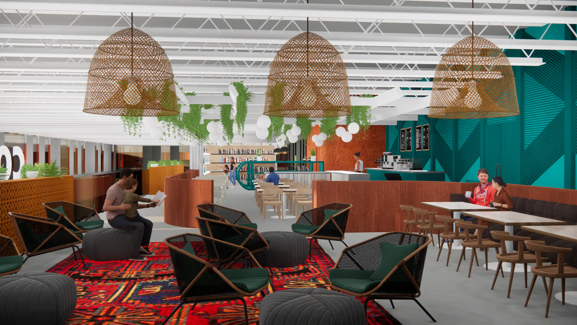
Instead of maxing out the number of tables in a restaurant or rooms in a hotel, many of today's hospitality operators are striving to be more creative with the square footage at their disposal. Sometimes, that means leaving space empty to add to the sense of drama. Just think of the difference between a soaring, multi-level atrium versus a tiny lobby on a single floor. One example of such an impactful approach is the hotel lobby for The Beekman, named one of the best lobbies in the world by Condé Nast Traveler. The Martin Brudnizki-designed spot, writes Caitlin Morton, 'is unlike anywhere else in the city, with its nine-level atrium and lobby filled with pink velvet sofas and distressed green walls standing out as one of the coolest spaces in Lower Manhattan.'
'¯
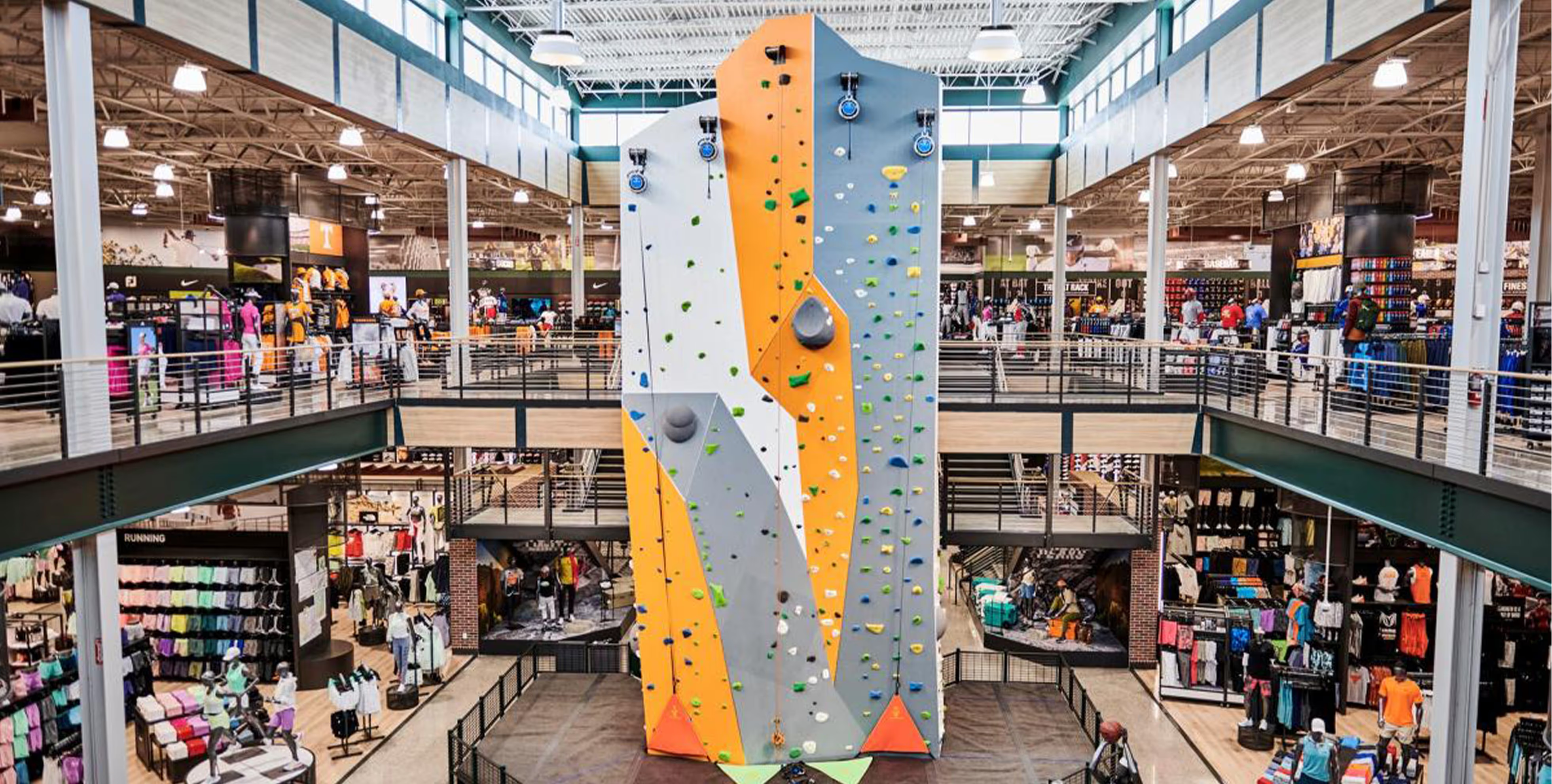
In other cases, the goal might be to give people novel things to do. Indeed, some retailers have long incorporated hospitality-like entertainment components into their stores. One of the latest is Dick's House of Sport, where you can climb rock walls, test putters on artificial greens, or try out baseball bats in a virtual batting cage. Certain locations even boast their own outdoor athletic fields.
Of course, not every retailer can take the large-scale approach of a The Beekman or Dick's House of Sports. However, some retail offerings do lend themselves to alternative uses of space'especially those that sell products that people want to touch, feel, test or play with. (As we speak, tech junkies are flocking to Apple stores to experience the Apple Vision Pro.)
'
Many retailers could reinforce their brands by setting aside space for a few fun, novel or relaxing experiences. A high-end toy store, for example, could create a children's play area ringed with comfortable seating for parents. Retailers could consider huddling with their designers and brand consultants to decide if adding sumptuous hangouts, new tech or product-testing areas could be a fit. But commitment is key'if you're putting in a vinyl-record listening lounge or a wizardry-themed escape room, be sure to do it right. There's no point in adding a 'so-what?' experience to the store.'¯
Highlight the local dimension
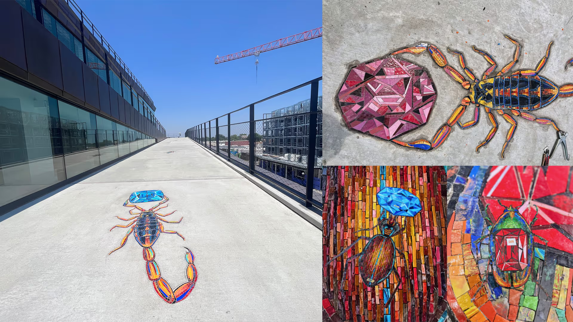
Hospitality designers often emphasize local ties'stroll into a hotel lobby or restaurant dining room in music hotspots like Athens, Georgia, or Austin, Texas, and you might see guitars hanging on the wall, or pics of REM or Willie Nelson. Many designers of hotels, restaurants and resorts will take cues from local flora and fauna, historic architecture in the neighborhood, or the signature agricultural or manufacturing products for which a place is known. Especially when the store is located in a tourist destination, retailers can add interest by doing the same.
Indeed, Barnes & Noble CEO James Daunt has won kudos for striving to make the booksellers' stores operate more like independent shops. In some cases, that means stocking more locally focused histories and hosting more book-signings and readings by local authors. Barnes & Noble also has empowered its local store managers to call more of the shots.
Designers can help retailers execute on such localization strategies. For example, they might help them bring locally focused merchandise or events more to the front of the store, or show them ways to use lighting, color palettes and shelf placement to give these elements more pop.
Keep evolving
Given today's elevated and more complex consumer expectations, both retail and hospitality operators need to stay ahead of the curve. One approach is to home in on the evolving needs of different types of customers using the space. You can then bring in amenities, design features and entertainment components that appeal to these specific demographic groups.
Often, this means designing for multiple generations and varying the experience based on the time of day. Morning hours, for instance, might be quieter, with gentler lighting. As the day progresses, the retailer turns up the lights and music, helping to facilitate a social gathering place.
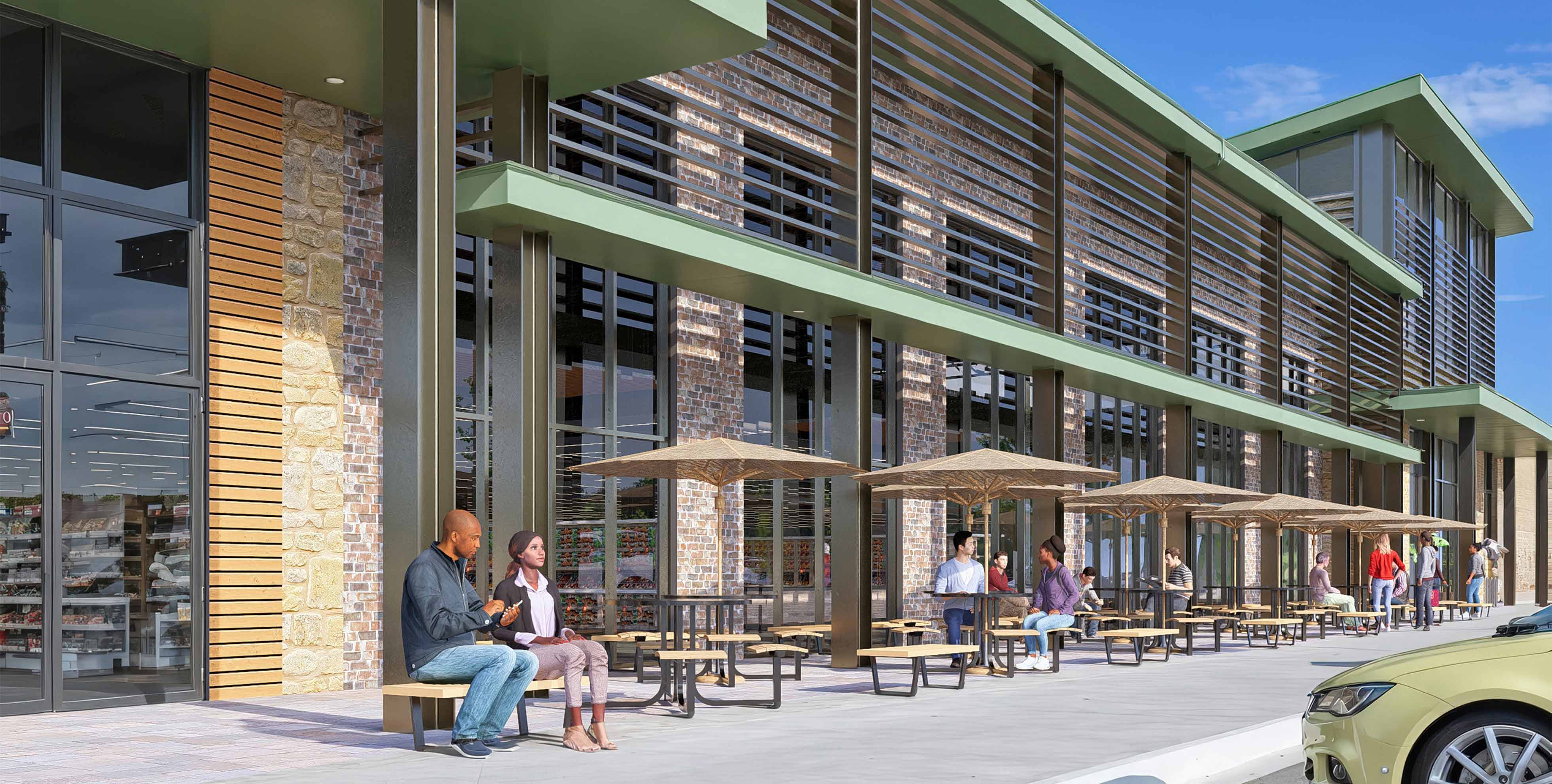
It's also important to periodically refresh the space. That could be as simple as repainting, redoing the restrooms or bringing in new fixtures, flooring and/or product lineups and displays. The exterior façade is particularly important, because the customer experience starts from the outside. At the same time, it's important to remember that your building and store are part of your brand. Take care not to change so much that you alienate loyal customers.

Keep it simple
Wowing customers and guests is important, but the best hospitality operators have always understood the importance of making the experience easy and comfortable, too.
When retailers overcomplicate things, making it difficult for people to find what they are looking for or even understand what they are seeing, they lose traffic and sales. Look carefully at your demographics to make sure people feel at ease when they are in the store. Is your use of technology appropriate to your audience? Is your space configured to make it easy to build community through events?
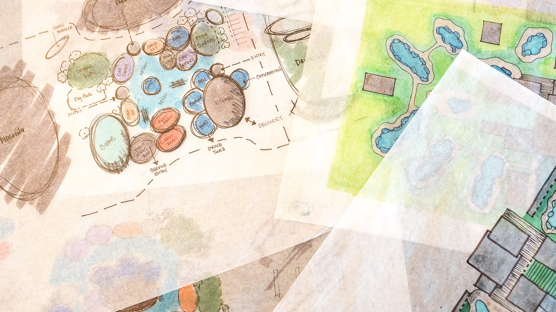
It can also be beneficial to take an integrated approach to experiential design. Rather than have your store designers, civil engineers and landscape architects tackle the project independently, bring them together as early as possible in the planning stages. By combining their respective areas of expertise, they can find efficiencies, inform each other of various constraints and craft an overall journey that, for the customer, feels complete and satisfying from beginning to end.
'¯
Veteran architect James Owens (AIA, NCARB) is a Vice President at HFA Architecture & Engineering, which has worked with a Who's Who of national retailers, including Walmart, Target, Sally Beauty and Walgreens. He can be reached at james.owens@hfa-ae.com.
'

.avif)

.avif)


.avif)
.avif)
